Download
1 / 13
130 likes | 201 Vues
Learn how to identify and analyze misleading graphs in order to avoid misinterpretation of data. Understand how data displays can influence conclusions and how to redraw misleading graphs effectively.

E N D
Preview Warm Up California Standards Lesson Presentation
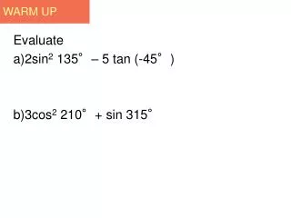
Warm Up Use the graph for questions 1-3. 1. What network had the most viewers? 2. What network had the fewest viewers? 3. What network(s) had about the same viewership? ABC FOX CBS, NBC
California Standards SDAP2.3 Analyze data displays and explain why the way in which the question was asked might have influenced the results obtained and why the way in which the results were displayed might have influenced the conclusions reached. Also covered: SDAP2.5
Objective: You will learn how to (YWLHT) identify and analyze misleading graphs.
Sometimes data is presented in a way that influences how the data is interpreted. A data display that distorts information in order to persuade can be misleading. An axis in a graph can be “broken” to make the graph easier to read. However, a broken axis can also be misleading. In the graph at right, the cost per minute for service with Company B looks like it is twice as much as the cost for service with Company A. In fact, the difference is only $0.10 per minute.
Example 1: Weather Application Which graph could be misleading? Why? The graph at left could be misleading. It gives the impression of greater temperature change because the vertical axis does not begin at zero.
Which graph could be misleading? Why? Average Restaurant Meal Price Graph A Graph B 20 15 10 5 0 25 20 15 10 5 Price per meal Price per meal Gino’s Gino’s Village Grill Pasta City City Diner Village Grill Pasta City City Diner Check It Out! Example 2 Graph B could be misleading. The vertical axis does not begin at zero, so differences in scales appear greater.
Example 3: Analyzing Misleading Graphs Explain how you could redraw the graph so it would not be misleading. Draw the entire vertical scale on the graph.
Example 4: Analyzing Misleading Graphs Explain how you could redraw the graph so it would not be misleading. Make the icons for cars, light trucks, and heavy trucks the same size.
Taxicab Fares 13 12 11 10 Fare ($) Mon Tue Wed Thu Fri Check It Out! Example 5 Explain how you could redraw the graph so it would not be misleading. Draw the entire vertical scale on the graph. The vertical axis is broken, so differences in fare appear greater.
Water Consumed 48 40 32 24 16 Ounces of Water Mark Frank Mila Yvonne Check It Out! Example 6 Explain how you could redraw the graph so it would not be misleading. Draw the entire vertical scale on the graph. The vertical axis does not start at zero so differences in water consumed seem greater.
Home Learning Click to view Lesson Videos
Lesson Quiz Explain why each graph could be misleading and why. 1. 2. The scale does not start at 0, so it looks like fewer people like each type of animal. The vertical scale does not start at 0, so it looks like sales revenues were small.