Mastering Plotting Techniques: Chapter 5 Overview
In this chapter, learn how to create and label 2D plots, adjust appearance, use subplots, create 3D plots, and utilize interactive plotting tools. Dive into XY plots common in engineering, various line plot techniques, complex arrays, customizing line styles, colors, and markers, axis scaling, and annotating plots with legends and text. Discover subplots and explore other 2D plot types like polar plots, logarithmic plots, bar graphs, and more. Practice exercises included to enhance plotting skills.

Mastering Plotting Techniques: Chapter 5 Overview
E N D
Presentation Transcript
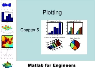
Plotting Chapter 5
In this chapter we’ll cover • Creating and labeling two dimensional plots • Adjusting the appearance of your plots • Using subplots • Creating three dimensional plots • Using the interactive plotting tools
Section 5.1Two Dimensional Plots • The xy plot is the most commonly used plot by engineers • The independent variable is usually called x • The dependent variable is usually called y
Consider this xy data Time is the independent variable and distance is the dependent variable
Define x and y and call the plot function You can use any variable name that is convenient for the dependent and independent variables
Engineers always add … • Title • X axis label, complete with units • Y axis label, complete with units • Often it is useful to add a grid
Creating multiple plots • Matlab overwrites the figure window every time you request a new plot • To open a new figure window use the figure function – for example figure(2)
Plots with multiple lines • hold on • Freezes the current plot, so that an additional plot can be overlaid • When you use this approach the additional line is drawn in blue – the default drawing color
The hold on command freezes the plot The second line is also drawn in blue, on top of the original plot To unfreeze the plot use the hold off command
You can also create multiple lines on a single graph with one command • Using this approach each line defaults to a different color
Variations • If you use the plot command with a single matrix, Matlab plots the values versus the index number • Usually this type of data is plotted on a bar graph • When plotted on an xy grid, it is often called a line graph
If you want to create multiple plots, all with the same x value you can… • Use alternating sets of ordered pairs • plot(x,y1,x,y2,x,y3,x,y4) • Or group the y values into a matrix • z=[y1,y2,y3,y4] • plot(x,z)
Matrix of Y values Alternating sets of ordered pairs
The peaks(100) function creates a 100x100 array of values. Since this is a plot of a single variable, we get 100 different line plots
Plots of Complex Arrays • If the input to the plot command is a single array of complex numbers, Matlab plots the real component on the x-axis and the imaginary component on the y-axis
Multiple arrays of complex numbers • If you try to use two arrays of complex numbers in the plot function, the imaginary components are ignored
Line, Color and Mark Style • You can change the appearance of your plots by selecting user defined • line styles • color • mark styles • Try using help plot for a list of available styles
Specify your choices in a string • For example • plot(x,y,':ok') • strings are identified with a tick mark • if you don’t specify style, a default is used • line style – none • mark style – none • color - blue
plot(x,y,':ok') • In this command • the : means use a dotted line • the o means use a circle to mark each point • the letter k indicates that the graph should be drawn in black • (b indicates blue)
dotted line circles black
specify the drawing parameters for each line after the ordered pairs that define the line
Axis scaling • Matlab automatically scales each plot to completely fill the graph • If you want to specify a different axis – use the axis command axis([xmin,xmax,ymin,ymax]) • Lets change the axes on the graph we just looked at
Annotating Your Plots • You can also add • legends • textbox • Of course you should always add • title • axis labels
Improving your labels You can use Greek letters in your labels by putting a backslash (\) before the name of the letter. For example: title(‘\alpha \beta \gamma’) creates the plot title α β γ To create a superscript use curly brackets title(‘x^{2}’) gives x2
Tex Markup Language • These label improvements use the Tex Markup Language • Use the Help feature to find out more!!
Section 5.2Subplots • The subplot command allows you to subdivide the graphing window into a grid of m rows and n columns • subplot(m,n,p) rows columns location
subplot(2,2,1) 2 columns 2 1 2 rows 3 4
Section 5.3Other Types of 2-D Plots • Polar Plots • Logarithmic Plots • Bar Graphs • Pie Charts • Histograms • X-Y graphs with 2 y axes • Function Plots
Polar Plots • Some functions are easier to specify using polar coordinates than by using rectangular coordinates • For example the equation of a circle is • y=sin(x) in polar coordinates
Practice Exercise 5.3 • Try these exercises to create some interesting shapes
Logarithmic Plots • A logarithmic scale (base 10) is convenient when • a variable ranges over many orders of magnitude, because the wide range of values can be graphed, without compressing the smaller values. • data varies exponentially.
plot – uses a linear scale on both axes • semilogy – uses a log10 scale on the y axis • semilogx – uses a log10 scale on the x axis • loglog – use a log10 scale on both axes
x-y plot – linear on both axes semilogx – log scale on the x axis semilogy – log scale on the y axis loglog – log scale on both axes
Bar Graphs and Pie Charts • Matlab includes a whole family of bar graphs and pie charts • bar(x) – vertical bar graph • barh(x) – horizontal bar graph • bar3(x) – 3-D vertical bar graph • bar3h(x) – 3-D horizontal bar graph • pie(x) – pie chart • pie3(x) – 3-D pie chart
Histograms • A histogram is a plot showing the distribution of a set of values