Download
1 / 10
110 likes | 460 Vues
Learn to construct histograms with unequal class intervals for cars' speeds, ramblers' distance walked, and plants' heights.

E N D
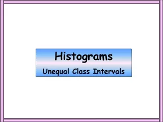
Histograms Unequal Class Intervals
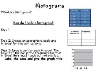
Cars 100 90 80 70 60 50 frequency density 40 240 ? 30 0 30 20 10 60 100 80 110 120 50 90 70 0 10 20 30 40 Speed mph Constructing a histogram from a frequency table Example Question 1: The frequency table gives information on the speeds (mph) of a sample of drivers using a motorway. Construct a Histogram for this data. 8 32 50 240/30 = 8 78 320/10 = 32 96 500/10 = 50 82 780/10 = 78 16 960/10 = 96 1. The class intervals are unequal so a frequency density column is needed. 820/10 = 82 640/40 = 16 2. Scale the horizontal axis. 3. Calculate frequency densities and scale the vertical axis.
100 90 8 32 80 50 70 78 96 60 82 50 frequency density 16 40 30 20 10 60 100 80 110 120 50 90 70 0 10 20 30 40 Speed mph Constructing a histogram from a frequency table Example Question 1: The frequency table gives information on the speeds (mph) of a sample of drivers using a motorway. Construct a Histogram for this data. Recorded Speeds of Cars on a Motorway 4. Draw the bars and title.
Ramblers 5 4 3 frequency density 2 5 ? 0 1 1 6 10 8 9 3 0 1 2 4 5 7 Distance (Miles) Example Question 2: The table shows the distance walked in miles by some ramblers on the Lincolnshire Wolds at the weekend. Draw a histogram for the data. 5 2 5 1 = 5 4 2 1 = 2 3 12 3 = 4 1.25 3 1 = 3 1. The class intervals are unequal so a frequency density column is needed. 5 4 = 1.25 2. Scale the horizontal axis. 3. Calculate frequency densities and scale the vertical axis.
5 Distance Walked by Ramblers 4 3 frequency density 2 1 6 10 8 9 3 0 1 2 4 5 7 Distance (Miles) Example Question 2 The table shows the distance walked in miles by some ramblers on the Lincolnshire Wolds at the weekend. Draw a histogram for the data. 5 2 4 3 1.25 4.Draw in the bars and title.
Plants 1.0 0.9 0.8 0.7 0.6 0.5 frequency density 0.4 4 ? 0.3 0 10 0.2 0.1 60 100 80 50 90 70 0 10 20 30 40 height (cm) Question 3: Robert sowed some seeds in his greenhouse and measured the heights of the plants 3 months later. The results are shown in the table. Draw a histogram for this data. 0.4 1 4 10 = 0.4 0.6 20 20 = 1 0.32 9 15 = 0.6 0.5 8 25 = 0.32 1. The class intervals are unequal so a frequency density column is needed. 15 30 = 0.5 2. Scale the horizontal axis. 3. Calculate frequency densities and scale the vertical axis.
1.0 Heights of Plants 0.9 0.8 0.7 0.6 0.5 frequency density 0.4 0.3 0.2 0.1 60 100 80 50 90 70 0 10 20 30 40 height (cm) Question 3: Robert sowed some seeds in his greenhouse and measured the heights of the plants 3 months later. The results are shown in the table. Draw a histogram for this data. 0.4 1 0.6 0.32 0.5 4.Draw in the bars and title.
Worksheet 1 Constructing a histogram from a frequency table. Example Question 1: The frequency table gives information on the speeds (mph) of a sample of drivers using a motorway. Construct a Histogram for this data.
Worksheet 2 Example Question 2 The table shows the distance walked in miles by some ramblers on the Lincolnshire Wolds at the weekend. Draw a histogram for the data.
Worksheet 3 Question 3. Robert sowed some seeds in his greenhouse and measured the heights of the plants 3 months later. The results are shown in the table. Draw a histogram for this data.