Download

1 / 6
60 likes | 181 Vues
This guide provides a comprehensive overview of how to interpret pie charts through various practical examples. Students in class 3B analyzed their modes of transport to school, while year 5 boys chose their favorite sports. Additional scenarios include train passengers' destinations from London and popular crisp flavors sold from a vending machine. The guide includes quantitative findings and percentages for each category, empowering pupils to understand data representation effectively.

E N D
Pie Charts Be able to interpret a pie chart
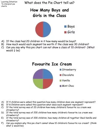
Interpreting Pie Charts 20 pupils in class 3B travel to school. From the chart find the number of pupils who travel by each method. Walk = Cycle = Bus =
180 boys in year 5 chose their favourite sport. From the chart find how many chose each sport.
300 passengers boarded a train in London. From the chart find how many are travelling to each destination.
150 packets of crisps were sold from a vending machine. From the chart find the number for each flavour. Find also the percentage for each.
Answers Sports: Football: 72, Rugby 40, Hockey 30, Cross Country 20, Squash 18 pupils. Passengers: Southampton 100, Bournemouth 75, Poole 50, Branksome 45, Parkstone 30. Crisps: Plain 60, Cheese & Onion 45,Salt & Vinegar 30, Prawn Cocktail 15