Understanding Pie Charts for Univariate Data Analysis
This guide explores the use of pie charts in data analysis, particularly for univariate analysis where one data variable is examined. Pie charts effectively compare percentages among categories, visually representing parts of a whole. Key considerations include limiting the number of categories to fewer than ten, ensuring that the "Other" category is minimal, and maintaining a total percentage close to 100. Practical examples, such as calculating the percentage of coffee orders from customers, are included for applied learning in spreadsheets.

Understanding Pie Charts for Univariate Data Analysis
E N D
Presentation Transcript
CSCI N207 Data Analysis Using Spreadsheet 9d. Pie Charts Lingma Acheson linglu@iupui.edu Department of Computer and Information Science, IUPUI
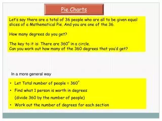
Pie Charts • Univariate analysis (one data variable, good for comparing percentages among categories) • Data represented as an area in a circle expressed as a percentage of a whole. Larger pie piece represents a larger percentage. • Number of categories should be kept to a minimum (<10). • “Other” category should represent a small percentage (if used). • Total percentage should add up to 100 to close to 100 (due to round ups) • Sometimes need to process data to come up with percentages
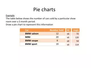
Practice • Find out the percentage of coffee orders from all the customers.