Graphing
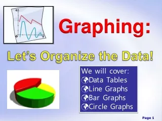
This guide explores the different types of graphs—bar graphs, pie charts, and line graphs—and when to use each one effectively. Bar graphs are excellent for quickly comparing data categories, such as grade distributions, while pie charts show percentages effectively, like student lunch preferences. Line graphs are ideal for depicting changes over time, like monthly sales trends. Key elements of labeling graphs are covered, including axes, intervals, and units of measurement. Understand graph components to accurately represent your data and enhance comprehension.


Graphing
E N D
Presentation Transcript
Graphing Wakefield 2011-2012
Choosing the Correct Type of Graph • Bar Graph • Compare data quickly & easily • Such as grade distribution • Growth of plants
Choosing the Correct Type of Graph • Pie Graph / Chart • Showing Percentages • % of student body who picked certain entrees @ lunch • % of a total budget to be used on certain items
Choosing the Correct Type of Graph • Line Graph • Looking @ changes over time • The number of swimsuits sold each month • The change in your height throughout the year
Line Graphs • In science class you use a line graph most of the time • To compare variables • (Variables are things in an experiment that change)
Labeling Graphs • All parts of a data table must be included in a graph • Graphs are simply pictures of the info collected in a data table
Labeling Graphs • There are 2 axes on a line graph • Horizontal axis / x-axis • Runs along the bottom of the graph horizontally • Vertical axis / y axis • Runs along the side of the graph vertically / up & down Y X
Labeling Graphs • Each axis must be labeled with the proper variable • X axis indicates the Independent variable • The variable that changes in an experiment • Y axis indicates the Dependent variable • The variable that is observed and is changed by the independent variable Y X
Labeling Graphs • Each axis must be labeled in the proper units • Meters – hours – seconds – degrees Celsius • Each entry should be spaced out in even intervals • The Rangeon a graph is the difference between the largest and smallest numbers in the data • The Interval is the range divided by the # of lines • When constructing your graph, make sure to space your intervals so that you take up as much of your graph as possible.
Plotting Data Points • The #’s in a data table are organized in pairs • Called Ordered Pairs
Interpolation and Extrapolation • Interpolation • A prediction made between known data points • Extrapolation • A prediction made beyond known data points
Graphing Vocabulary • Bar Graph • Data • Data Table • Dependent Variable • Extrapolation • Graph • Independent Variable • Interpolation • Interval • Line Graph
Graphing Vocabulary • Ordered Pairs • Pie/Circle Graph • Range • Title • Units • Variables • X-axis • Y-axis