Histograms REVIEWED
Histograms REVIEWED. Histograms are more than just an illustrative summary of the data sample. Typical examples are shown below (in R: see help(hist) for the use and adjustment of histogram plots, or class09a.R for some advanced uses of the hist()-function.). NY Central Park

Histograms REVIEWED
E N D
Presentation Transcript
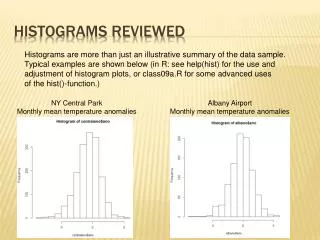
Histograms REVIEWED Histograms are more than just an illustrative summary of the data sample. Typical examples are shown below (in R: see help(hist) for the use and adjustment of histogram plots, or class09a.R for some advanced uses of the hist()-function.) NY Central Park Monthly mean temperature anomalies Albany Airport Monthly mean temperature anomalies
Histograms REVIEWED Shown are 31 data points from Albany’s monthly mean temperature anomalies (with respect to the climatological seasonal cycle 1981-2010)
Histograms REVIEWED Shown are 31 data points from Albany’s monthly mean temperature anomalies (with respect to the climatological seasonal cycle 1981-2010) the sample xi (i=1…N) has a range defined by minimum and maximum values in the sample. Step 1: find a large-enough range that covers all sample points Step2: break-up the range into equal-sized bins 1 2 3 xk xk+1 Δx Step 3: Count number of samples falling into bins: hk=3
Histograms REVIEWED Shown are 31 data points from Albany’s monthly mean temperature anomalies (with respect to the climatological seasonal cycle 1981-2010) the sample xi (i=1…N) has a range defined by minimum and maximum values in the sample. Step 1: find a large-enough range that covers all sample points Step2: break-up the range into equal-sized bins 1 2 3 xk xk+1 Δx Step 3: Count number of samples falling into bins: hk=3
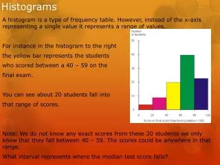
Histograms REVIEWED Shown is a histogram of Albany’s monthly mean temperature anomalies using n=31 sample (with respect to the climatological seasonal cycle 1981-2010) • Breakpoints from -9 to +9 deg. C • 19 breakpoints • 18 bins of width Δx = 1 C Frequency hk is the number of samples falling into the k-th bin: xk ≤ xobs < xk+1 hk counts the number of ‘events’ Note the n is the sample size and the sum only adds up to n if the bins cover the full range of the data sample.
Histograms REVIEWED Shown is a histogram of Albany’s monthly mean temperature anomalies using n=31 sample (with respect to the climatological seasonal cycle 1981-2010) The relative frequency is is a measure of the probability for the event that the sample xobs is falling into the k-th bin.
Histograms REVIEWED Shown are histograms based on 360 data points of Albany’s monthly mean temperature anomalies.
Histograms REVIEWED Shown are density plots from Albany’s monthly mean temperature anomalies (with respect to the climatological seasonal cycle 1981-2010) In this example the blue histogram shows the density fk calculated from a sample with n=31 sample data and 18 bins of width 1 deg C. The black line shows the density calculated with sample size n=360, bin width 0.5 deg C. In red, the density estimate based on n=720 samples, bin width 1/3 deg C.
Histograms REVIEWED Shown are density plots from Albany’s monthly mean temperature anomalies (with respect to the climatological seasonal cycle 1981-2010) Note: The exact mathematical formalism is not to be discussed in this Introductory course.
Histograms REVIEWED Shown are density plots from Albany’s monthly mean temperature anomalies (with respect to the climatological seasonal cycle 1981-2010) The density plot of monthly mean temperature anomalies shows a typical shape: unimodal, with characteristic symmetric flanks where the density increases towards the center, and very low density in the tails.
Consider a random number formed by summing (or averaging) independent random variables with arbitrary probability density distributions. As the number of random variables increases in the summation (averaging) process, the more will the distribution of the newly formed random variable approach a Gaussian Distribution. Central Limit Theorem Average over 5 uniformly distributed random variables (repeated 10000 time)