Understanding Graphs: Visualizing Data for Better Insights
Graphs are essential tools for visualizing data, allowing us to interpret complex information effectively. They tell a story, enabling comparisons and insights that numbers alone cannot provide. Different types of graphs, such as pie charts, bar graphs, and line charts, serve unique purposes: pie charts show parts of a whole, bar graphs illustrate comparisons across categories, and line graphs reveal trends over time. This guide explores how to effectively plot data, label graphs, and avoid common mistakes, enhancing your ability to present and understand data visually.

Understanding Graphs: Visualizing Data for Better Insights
E N D
Presentation Transcript
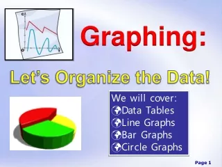
WHY GRAPH? • Visualize data • Tells a story • Make comparisons
Types of Graphs • Pie Chart • Division of the whole or parts of the whole, Easy to grasp, Label larger portions in the circle, smaller out side with connecting lines • Bar – called histogram • Numerical dimensions are shown in bars or varying lengths, shows comparisons, multiple comparisons are possible • Line • Shows comparisons, widely Used, relationship through time
Data Tables Title • Title • Variables • Units Plot on x-axis Plot on y-axis
Layout Y Leave room for labels X
Selecting scales Speed of Car 160 Make sure it will fit on the paper before you number By “fives or “tens” 0 10 By “ones”
Labels Speed of Car • Title • Variables • Units Distance(m) Time (sec)
Plotting Data Points • Where does each set of variables meet on the graph? 5 4 3 2 1 1
Lines and Curves • See board
Reading Graphs Interpolation - reading inside the graph Extrapolation - reading beyond limits of graph
Common Mistakes • Missing labels – title, variables, unit • Graph too small • Uneven scale • Best fit line drawn incorrectly • Interpolations/extrapolations not shown with dotted line