Visualizing NFL Offense Points: Histograms and Scatterplots with R's ggplot2
This guide explores the visualization of NFL offense points using R's graphics package, focusing on histograms and scatterplots. It demonstrates how to create a histogram of NFL offense points and overlay a normal distribution curve to illustrate data distribution. The use of ggplot2 is highlighted, showcasing how to create layered graphics with customized titles, axes labels, and legends. Key parameters such as binwidth, colors, and gridlines, are also addressed, enabling clear representation of statistical data for better insights into NFL offenses.

Visualizing NFL Offense Points: Histograms and Scatterplots with R's ggplot2
E N D
Presentation Transcript
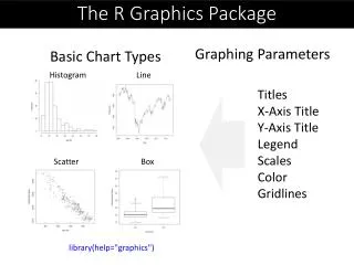
The R Graphics Package • Graphing Parameters • Basic Chart Types Histogram Line Titles X-Axis Title Y-Axis Title Legend Scales Color Gridlines Scatter Box library(help="graphics")
Histogram of NFL Offense hist(nfl$OffPtsA,freq=F, breaks = 25, ylim = c(0,0.14), col = "blue") curve(dnorm(x, mean=mean(nfl$OffPtsA), sd=sd(nfl$OffPtsA)), col="purple", add=T)
Grammar of Graphics Seven Components formations Legend Axes
ggplot2 Components The anatomy of a graph
ggplot2 In ggplot2 a plot is made up of layers. Pl o t
ggplot2: geoms http://docs.ggplot2.org/current/
Histograms: NFL Example • Create the plot object: nflHistogram <- ggplot(nfl, aes(OffPtsA)) + opts(legend.position = "none") • Add the graphical layer: nflHistogram+ geom_histogram(binwidth = 0.4 ) + labs(x = "NFL Offense Points", y = "Frequency")