Chapter 2: Frequency Distributions and Graphs
Chapter 2: Frequency Distributions and Graphs. Example: Based on a stress questionnaire given to N = 151 students (from Aron , Paris, & Aron , 1995). Sample question:

Chapter 2: Frequency Distributions and Graphs
E N D
Presentation Transcript
Chapter 2: Frequency Distributions and Graphs • Example: Based on a stress questionnaire given to N =151 students (from Aron, Paris, & Aron, 1995). Sample question: • How stressed have you been in the last 2½ weeks, on a scale of 0 to 10 (0 = not at all stressed, 10 = as stressed as possible)? • We could list all 151 scores, but: • this is not very efficient • patterns are hard to detect Prepared by Samantha Gaies, M.A.
Simplest Solution: Regular Frequency Distribution • Shows how often each score occurs (i.e., its frequency) • Allows us to see patterns Prepared by Samantha Gaies, M.A.
Cumulative Frequency Distribution: sums the frequencies at and below a particular value • Can determine the number of scores at or below your score • E.g., the cf for a stress rating of 7 is 96, so someone with that rating is reporting as much or more stress than 96 of the 151 students. Prepared by Samantha Gaies, M.A.
Grouped Frequency Distribution • Example: Moorehouseand Sanders (1992): Children’s attitudes toward learning and work (N = 153) • Interval width (i) = 10 • Number of intervals = 11 Prepared by Samantha Gaies, M.A.
Percentiles and Percentile Ranks • Definitions • Percentile Rank (of a score): a single number that gives the percent of cases in the specific reference group scoring at or below that score. It can be found by con-verting the cf of the score to a percentage (e.g., the PR corresponding to a score of 7 in the stress study is: 96/156 ×100 = 61.5). • Percentile: the score at or below which a given percent of the cases lie. First, find the cf corresponding to the desired percen-tile, and then find the score that is close to that cf (e.g., the cf for the 43rd percentile is: .43 × N, where N is the total number of scores; for the stress study, N = 151, so the desired cf is .43 × 151 = 64.9. Thus, the 43rd percentile corresponds approximately to a score of 6, which has a cf of 65). Prepared by Samantha Gaies, M.A.
Percentiles and Percentile Ranks for Grouped Distributions • PR for an Upper Real Limit • e.g., the upper real limit of the 80–89 interval in the Moorehouse & Sanders table is 89.5, and the corresponding cf is 72. Therefore, the PR for 89.5 is 72/153 × 100 = 47 (i.e., the 47th percentile is 89.5). The PR for a score of 85 is about 43, because its cf is about 66 (about halfway between cfs of 59 and 72 in the table), and 66/153 ×100 = 43.1 • Deciles and Quartiles • The percentiles of greatest interest are the deciles and quartiles. The fifth decile (or second quartile) is called the median. • Finding the median means finding the score that corresponds to a cf of .5N. For the M & S data, the cf for the median = .5 × 153 = 76.5, which falls between cfs of 72 and 95 in the table, which correspond to the upper real limits of 89.5 and 99.5. Thus, the score at the median is about 92. Prepared by Samantha Gaies, M.A.
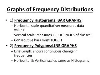
Graphic Representations: • Bar Chart: The heights of the bars indicate frequency of occurrence; the bars do not touch, because the variable represented on the horizontal axis consists of distinct categories. • Example: Different types of family house-holds in U.S. in 1994 (see bar chart below). • Frequency equals the proportion multiplied by the total sample size (68.5 million) (U.S. Census Bureau) Prepared by Samantha Gaies, M.A.
Histogram:The heights of the bars indicate frequency of occurrence; the bars do touch, because the variable represented on the horizontal axis is continuous, and each interval extends from one upper real limit to the next. Example: Based on the stress rating data of Aron, Paris, and Aron (1995). See histogram below: Prepared by Samantha Gaies, M.A.
Regular Frequency Polygon: Points are placed above the midpoints of the intervals in the histogram of the previous slide, corresponding to the frequencies of the intervals (based on the data from Aron, Paris, & Aron,1995). Prepared by Samantha Gaies, M.A.
Cumulative Frequency Polygon:Points are placed above the upper real limits of the intervals in the histogram of the previous slide, and correspond to the cfs of those intervals (based on the data from Aron, Paris, & Aron,1995) Prepared by Samantha Gaies, M.A.
Stem-and-Leaf Display: Example: The ratings range from 25 to 120; the stems represent the tens place for each number in the plot below (based on the data of Moorehouse & Sanders,1992). You can see the pattern of the distribution by looking at the plot sideways. Prepared by Samantha Gaies, M.A.
Shapes of Frequency Distributions • Symmetry vs. Skewness • Easy exams tend to produce negatively skewed distributions (scores are bunched at the high end and trail off at the low end). • Hard exams tend to produce positively skewed distributions(scores are bunched at the low end and trail off at the high end). • Exams that are medium in difficulty tend to produce symmetrical distributions • Modality • Distributions with one distinct peak are called unimodal. • Distributions with two distinct peaks are called bimodal. • Distributions with more than two distinct peaks are unusual. Prepared by Samantha Gaies, M.A.