Frequency Distributions and Graphs
Frequency Distributions and Graphs. Where do we start?. Quantitative Data is a set that can be numerically represented. Dealing With a Lot of Numbers.

Frequency Distributions and Graphs
E N D
Presentation Transcript
Where do we start? • Quantitative Data is a set that can be numerically represented.
Dealing With a Lot of Numbers... • When looking at large sets of quantitative data, it can be difficult to get a sense of what the numbers are telling us without summarizing the numbers in some way.
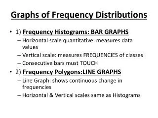
What do these data tell us? • Make a table • Frequency Distribution • Make a picture • Histogram • Stem-and-Leaf Display • Describe the distribution • Shape, center, spread, outliers
Frequency Distribution • Chart or table with 3 required columns: • Classes (# given) • Width = • Frequency • Cumulative Frequency
Example The data shown (in millions of dollars) are the values of the 30 NFL franchises. What can you tell me about this data by looking at the raw data?
Frequency Distribution (8 Classes) • Start by sorting the data • Class width = (max – min)/(# of classes) = (320 – 170) / 8 = 150 / 8 = 18.75 ≈ 19
Histogram To make a histogram add and subtract 0.5 from either end of the classes.
Histogram To make a histogram put boundaries on x-axis and frequencies on y-axis.
Displaying Quantitative Data • Stem and Leaf Display • Leaf • Contains the last digit of the values • Arranged in increasing order away from stem • Stem • Contains the rest of the values • Arranged in increasing order from top to bottom
Example – Spurs • Last 20 scores of regular season games (’05/’06). 89 115 103 80 104 83 86 87 95 106 96 98 102 98 92 107 92 108 96 88
Displaying Quantitative Data • Back-to-back Stem-and-Leaf Display • Used to compare two variables • Stems in center column • Leafs for one variable – right side • Leafs for other variable – left side • Arrange leafs in increasing order, AWAY FROM STEM!
Example – Compare Spurs to Pistons • Last 20 scores of Pistons regular season games. 80 93 103 103 96 98 87 95 101 109 112 101 97 74 75 82 91 108 103 105
Looking at Distributions • Always report 4 things when describing a distribution: • Shape • Center • Spread • Outliers
Looking at Distributions • Shape • How many humps (called modes)? • None = uniform • One = unimodal • Two = bimodal • Three or more = multimodal
Looking at Distributions • Shape • Is it symmetric? • Symmetric = roughly equal on both sides • Skewed = more values on one side • Right = Tail stretches to large values • Left = Tail stretches to small values
Looking at Distributions • Center • A single number to describe the data • Can calculate different numbers for center • For this chapter, just EYE BALL IT – we will learn numerical descriptions next chapter
Looking at Distributions • Spread • Variation in the data values • Crude measure: Range = max. value – min. value • Again, next chapter spread will be a single number • Outliers? • Interesting observations in data • Can impact statistical methods
2000 Census 25 20 15 Frequency 10 5 0 4 6 8 10 12 14 16 18 Pop Over 65 65 & Over Histogram
Categorical Data • Categorical variables are variables that cannot be measured numerically • Examples • Gender • Religion • Colors • Race • Occupation • Emotions
Describing Categorical Data • Pie Charts • Bar Charts
Pie Chart • Displays percentage of whole (for each category) • Must include all possible categories
Example of Pie Chart • 2004 Enrollment Iowa State University • Agriculture 12% • Business 17% • Design 8% • Education 7% • Engineering 22% • F&C Sciences 6% • Liberal Arts 28%
Bar Charts • Displays either number or percentage for each category • Do not need to include all possible categories
Example of a Bar Chart • Number of students from Iowa and beyond • Iowa: 16424 • Non-Iowa U.S.: 4157 • Foreign: 741