Frequency Distributions and Graphs
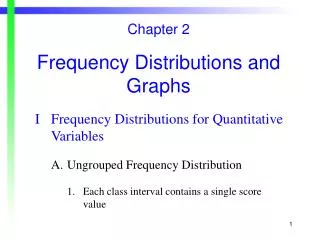
Chapter 2. Frequency Distributions and Graphs. A frequency distribution is the organization of raw data in table from, using classes and frequency. . The number of miles that the employees of a large department store traveled to work each day.

Frequency Distributions and Graphs
E N D
Presentation Transcript
Chapter 2 Frequency Distributions and Graphs
A frequency distribution is the organization of raw data in table from, using classes and frequency.
The number of miles that the employees of a large department store traveled to work each day
Number of classes It should be between 5 and 20. Some Statisticians use “ 2k “ rule.
2 to k rule Essentially we would look to construct k classes for our frequency distribution, when the value of 2k first exceeds the number of observations in our sample. So, if we had a sample with 39 observations, we would first consider constructing 6 classes, because 26 = 64, the first power of 2 with a value larger than the sample size of 39.
A guide, not a dictator. Strictly speaking the 2k rule is a guide, not a rule. If the 2k rule suggests you need 6 classes, also consider using 5 or 7 classes ... but certainly not 3 or 9.
Class interval or class width H : the highest value, L: the smallest value • Class interval can also be estimated based on # of observations
Select the lower limit of the first class and set the limits of each class It could be L or any value smaller than L. It should be an even multiple of the class interval.
There should be between 5 and 20 classes. • The classes must be continuous. • The classes must be exhaustive. • The classes must be mutually exclusive. • The classes must be equal in width.
Relative frequency • Relative frequency of a class is the frequency of that class divided by to total number of frequency.
Example These data represent the record high temperatures for each of the 50 states. Construct a grouped frequency distribution for the data using 7 classes.
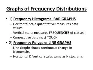
Histogram A histogram is a graph that displays the data by using contiguous vertical bars (unless the frequency of a class is 0) of various heights to represent the frequencies of the classes.
Example Construct a histogram to represent the data shown below for the record high temperature:
18 Histogram 15 12 9 6 3 99.5 104.5 109.5 114.5 119.5 124.5 129.5 • The largest concentration is in the class • 109.5 – 114.5.
18 Frequency Polygone 15 12 9 6 3 99.5 104.5 109.5 114.5 119.5 124.5 129.5
The Ogive is a graph that represents the cumulative frequencies for the classes in a frequency distribution.
Cumulative Frequency Polygone 50 40 30 20 10 99.5 104.5 109.5 114.5 119.5 124.5 129.5
Other types of Graphs Bar Chart Bar Chart is use to represent a frequency distribution for a categorical variable, and the frequencies are displayed by the heights of vertical bars.
Example The table shown here displays the number of crimes investigated by law enforcement officers in U.S. national parks during 1995. Construct a Bar chart for the data.
164 150 100 50 34 29 13 Homicide Assault Rape Robbery Total number of crime: 234
Pie Graph A pie graph is a circle that is divided into sections or wedges according to the percentage of frequencies in each category of the distribution.
Example This frequency distribution shows the number of pounds of each snack food eaten during the 1998 Super Bowl. Construct a pie graph for the data.
We need to find percentages for each category and then compute the corresponding sectors so that we divide the circle proportionally.
Stem and Leaf Plots A stem and leaf plot is a data plot that uses part of the data value as the stem and part of the data value as the leaf to form groups or classes.
Example At an outpatient testing center, the number of cardiograms performed each day for 20 days is shown. Construct a tem and leaf plot for the data.
It is helpful to arrange the data in order but it is not required. 02, 13, 14, 20, 23, 25, 31, 32, 32, 32, 32, 33, 36, 43, 44, 44, 45, 51, 52, 57
EXERCISES 1 The following data represent the color of men’s dress shirts purchased in the men’s department of a large department store. Construct a categorical frequency distribution, bar chart and pie chart for the data (W= white, BL= blue, BR= brown, Y= yellow, G= gray).
EXERCISES 2 The ages of the signers of the Declaration of Independence of the US are shown below.
EXERCISES 2 (Cont.) Construct a frequency distribution using seven classes. Include relative frequency, percentage and Cumulative frequency. Construct a histogram, frequency poly-gone, and Ogive. Develop a stem-and-leaf plot for the data.
Thank You for your attention! Good Luck!