Download
1 / 28
330 likes | 691 Vues
Sect. 2-1 Frequency Distributions and Their graphs. Objective SWBAT construct a frequency distribution including limits ,boundaries , midpoints, relative frequencies, and cumulative frequencies

E N D
Sect. 2-1 Frequency Distributions and Their graphs Objective SWBAT construct a frequency distribution including limits ,boundaries , midpoints, relative frequencies, and cumulative frequencies Also how to construct frequency histograms, frequency polygons, , relative frequency histograms, and ogives.
Guidelines Constructing a Frequency Distribution from a Data Set • Decide on the number of classes to include in the frequency Distribution. The number of classes should be between five and twenty; otherwise it may be difficult to detect any patterns. 2. Find the class width as follows . Determine the range of the data . Divide the range by the number of classes, and round up to the next convenient number. 3. Find the class limits. You can use the minimum data entry as the lower limit of the first class. To find the remaining lower limits, add the class width to the lower limit of the preceding class. Then find the upper limit of the first class. Remember that classes can not overlap. Find the remaining upper class limits. 4. Make a tally mark for each data entry in the row of the appropriate class. 5. Count the tally marks to find the total frequency f for each class.
Example • Constructing a frequency distribution chart from a Data Set • The following sample data set lists the number of minutes 50 Internet subscribers spent on the Internet during their most recent session. Construct a frequency chart that has 7 classes. • 50 40 41 17 11 7 22 44 28 21 19 23 37 51 54 42 88 • 41 78 56 72 56 17 7 69 30 80 56 29 33 46 31 39 20 • 18 29 34 59 73 77 36 39 30 62 54 67 39 31 53 44
Solution The minimum data entry is 7 and the maximum is 88 so the range is 81. • The number4 of classes (7) is stated in the problem. range No. of classes Round up to 12
Try it Yourself Construct a frequency distribution using the ages of the residents of Akhiok given in the opening on page 30. Use six classes. a. State the number of classes b. Find the minimum and maximum values and the class width • Find the class limits. • Tally the data entries e. Write the fr4equency for each class.
Definition Lower class limit + Upper class limit 2 Class frequency Sample size
Example Midpoints, Relative and Cumulative frequencies Using the frequency distribution constructed in example 1, find the midpoint , relative frequency, and cumulative frequency for each class. Identify any patterns. SOLUTION The midpoint , relative, and cumulative frequency for the first three classes are calculated as follows. Relative Cumulative Class f Midpoint frequency frequency 7 – 18 6 7-18 ∕ 2 = 12.5 6 / 50 = 0.12 6 19-30 10 19+ 30 / 2 = 24.5 10/50 = 0.2 6+10 = 16 31 – 42 13 31+ 42 / 2 = 36.5 13/50 = 0.26 16+13 = 29
Frequency Distribution for Internet usage (in minutes) There are several patterns in the data set. For instance, the most common time span that users spent online was 31 to 42 minutes.
Try it Yourself 2 Using the frequency distribution constructed in try it Yourself1, find the midpoint, relative frequency, and cumulative frequency for each class. Identify any patterns. • Use the formulas to find each midpoint, relative frequency, and cumulative frequency.. b. Organize your results in a frequency distribution. c. Identify patterns that emerge from the data.
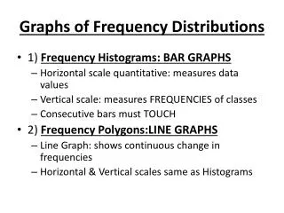
Graphs of frequency Distributions Definition A frequency histogram is a bar graph that represents the frequency distribution of a data set. A histogram has the following properties. 1. The horizontal scale is quantitative and measures the data values. 2. The vertical scale measures the frequencies of the classes. 3. Consecutive bars must touch.
Example 3 Constructing a frequency Histogram Draw a histogram for the frequency Distribution in Example 2 describe any patterns. The boundaries of the remaining classes are shown in the table at the left. First find the class boundaries. The distance from the upper limit of the first class to the lower limit of the second class is 19-18 = 1. half this distance is 0.5. So the lower and upper boundaries of the first class are as follows. First Class boundary = 7- 0.5 = 6.5 First class upper boundary = 18 + 0.5 = 18.5
Try it yourself Use the frequency distribution form try it yourself 1 to construct a frequency histogram that represents the ages of the residents of Akhiok. Describe any patterns. • Find the class boundaries • Choose the appropriate horizontal and vertical axes. • Use the frequency distribution to find the height of each bar. • Describe any patterns for the data.
Example 4 Constructing a frequency Polygon To construct a frequency polygon use the same horizontal and vertical scales that were used in the histogram labeled with class midpoints in example 3. Then plot the points that represent the midpoint and frequency of each class and connect the points in order from left to right. Because the graph should begin and end on the horizontal axis, extend the left side to one class width before the first class midpoint and extend the right side to one class width after the last class midpoint. You can see that the frequency of subscribers increase up to 36.5 minutes and then decreases.
Try it yourself Construct a frequency polygon that represents the ages of the residents of Akhiok. Describe any patterns • Choose the appropriate horizontal and vertical scales • Plot points that represent the midpoint and frequency for each class. • Connect the points and extend the sides as necessary. • Describe any patterns fore the data.
Example 5 Constructing a relative frequency Histogram Draw a relative frequency histogram for the frequency distribution in example 2. Solution : The relative frequency histogram is shown. Notice that the shape of the histogram is the same as the frequency histogram constructed in example 3.
Try it Yourself Construct a relative frequency Histogram that represents the ages of the residents of Akhiok. • Use the same horizontal scale as used in the frequency histogram. • Revise the vertical scale to reflect relative frequencies. • Use the relative frequencies to find the height of each bar.
Constructing an Ogive Draw an Ogive for the frequency distribution in example 2. Estimate how many subscribers spent less than 60 minutes during their last session. Also use the graph to estimate when the greatest increase in usage occurs. Using the frequency distribution you can construct the ogive shown . The upper class boundaries, frequencies, and the cumulative frequencies are listed in the table. Notice that the graph starts at 6.5 where the cumulative frequency is zero and the grasph ends at 90.5 where the cumulative frequency is 50. From the ogive you can see that subscribers spent less than 60 minutes online during their last session.
Try it yourself Construct an ogive that represents the ages of the residents of Akhiok. Estimate the number of residents who are less than 45 years old. a. Specify the horizontal and vertical scales. b. Plot the points given by the upper class boundaries and the cumulative frequencies. c. Construct the graph. d. Estimate the number of residents who are less than 45 years old.
Example 7: Using technology to construct Histograms • Use a calculator to construct a Histogram for the frequency distribution in Example 2. Solution : Excel and TI – 83 have features for graphing histograms..