Graphing
Graphing. Types of Graphs. Pie Charts XY Graphs Bar Charts. What type of graph to use?. Pie Charts Limited in their applicability Can only be used when you have a quantitative variable associated with a list of categories where BOTH the categories and the quantities each add up to a WHOLE


Graphing
E N D
Presentation Transcript
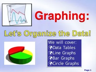
Types of Graphs • Pie Charts • XY Graphs • Bar Charts
What type of graph to use? • Pie Charts • Limited in their applicability • Can only be used when you have a quantitative variable associated with a list of categories where BOTH the categories and the quantities each add up to a WHOLE • The categories must be disjoint • Most common error – using a pie chart on a set of categories that do not make a whole & to use a pie chart when the categories overlap • Do not include the total in your pie chart • Add percentage data labels
What type of graph to use? • XY Graphs • Should be used when you have “a lot” of data points and the categories along the x-axis are numerical • Use the XY Scatter type and then choose a graph option with connected data points, usually • What Excel calls a “line graph” is very confusing and should essentially never be used (Excel “line graph” always treats the x-axis categorically)
What type of graph to use? • Bar Charts • Very flexible • Can be used whenever there is a quantitative variable associated with the categorical variable • Great when you have a limited amount of data or when you want to compare more than one series • If you do use a bar chart and have years along the x-axis, be sure the years are consecutive
How to make a pie chart • ../../Excel_Files/EnergyConsumption2005.xls • Select both the categories and the values • The graph needs a descriptive title • The percentages might need to be “increased” to show one or two decimals
How to make a Bar Chart • http://qrc.depaul.edu/Excel_Files/HomeHeating.xls • Advantages and disadvantages with bar charts • Main advantage is their succinctness and the ability they afford to make comparisons within categories and across categories • Best used in printed works so that a view can study them carefully • Disadvantage is that they sometimes present far too much information to view as part of a presentation • It is hard to make a single, clear point with them, and presenters tend not to leave them up long enough to absorb the information fully • People often make bar charts with quantitative data on the x-axis, but they are not careful about the fact that bar charts treats the x-axis categorically
How to Make an XY Graph • http://qrc.depaul.edu/Excel_Files/LakeMichiganLevels1988-2000.xls • Vocabulary: increasing/decreasing, absolute minimum/maximum, relative minimum/maximum, increasing at an increasing rate, decreasing at a decreasing rate, periodic • Be able to write paragraphs which describe what the graph is saying, generally going from left to right, telling the “story” of the graph
Guidelines for making an effective Graph • What is the purpose of making a graph from this data? • What type of graph should you make? • Pie • Bar • XY scatter (line) • Decide on a title and consider the Ws (who, what, where, and when) • Legend: yes or no? • Descriptive x-axis label (if applicable) • Descriptive y-axis label (if applicable) • Scale (if applicable) • Source
How to Describe Graphs • The graph should be able to stand alone without any words to tell the reader what they are looking at • If the reader doesn’t understand the graph without a caption (or story) then the graph isn’t very good • In a paragraph describing the graph, you should point out what you want the reader to know about the graph
Y-Axis Scale Effects • One of the most common ways graphs can be misleading • It has become more and more accepted in the media to adjust the y-axis