Exploring Temperature Variations in City A
Analyze temperature fluctuations in City A over a month. "Temperature (°C) vs. Time (days)" on X-axis, Y-axis labeled with temperature readings. Create clear and precise graphs with proper labeling for detailed insights.

Exploring Temperature Variations in City A
E N D
Presentation Transcript
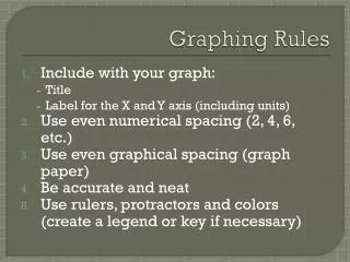
Graphing Rules • Include with your graph: • Title • Label for the X and Y axis (including units) • Use even numerical spacing (2, 4, 6, etc.) • Use even graphical spacing (graph paper) • Be accurate and neat • Use rulers, protractors and colors (create a legend or key if necessary)
How do I label the X and Y axis? • For bar graphs: • the names of items go on the x axis • the amounts go on the y axis • For line graphs: • the dependent variable is on the y axis • the independent variable is on the x axis
How do I label the X and Y axis? Example: